Showing posts with label Usability. Show all posts

23.10.07

Unwrapping Apple's Packaging Moments of Truth

Regular readers (if there are any left after this ridiculous hiatus) will know that despite my vocational specialism in web user experience, my desire to comment on an array of customer experience issues is a recurring theme of this blog. Something which I have never touched upon until now is packaging design.

Inspired by a Design Critique podcast I wanted readers to consider the experience of owning rather than consuming a product. More often than not User Experience Architects (UEAs) like me will pour insight and design into the choosing and purchasing of a product or service. We sometimes refer to these as ‘moments of truth’. Experience design shouldn’t stop there though, because the experience itself doesn’t.

In the podcast they discuss the packaging of an iPod (the 1st generation Nano as it happens) which I also own. Where this resonates with me is the fact that I didn’t purchase this product, it was a Christmas gift and as such I didn’t have the purchase experience; my first interaction with the product was to unwrap the box. At this point I’ll skip to the end; the box for my Nano sits proudly on my shelf. I haven’t retained the box for some perfunctory purpose to store the Nano again when I come to move house. I don’t keep it so that I can put the Nano away every night either. I keep it because, in itself, it’s a beautiful little piece of design that is worthy of display.

That morning when I received the gift I remember distinctly being impressed with the occasion of opening the packing. The box opens like a book, or perhaps a limited edition CD, the iPod was recessed into the box and encased in a cellophane wrapper so I could see it clearly and see its virginal newness. The tape that stuck the cellophane wrappers down was printed in an established Apple typeface, the whole package (and I use the word literally and metaphorically) was an example of minimalism and lean design. It almost seemed a shame to ruin it by actually getting the iPod out. However, once having done so it remained intact and thus it remains on my shelf.

And I’m not the only one who was impressed. All over the web you’ll find blog posts, flickr photosets and suchlike documenting the arrival and unpacking of their iPods and other Apple consumables. Apple are thinking experientially about ownership, about the loyalty that owning one of their items creates. Hence why so many of their consumers are brand advocates. This is a wonderful example of marketing extending into ownership to create or strengthen a positive opinion of the brand.

Maybe this is not by design, but by accident. Maybe it’s the result of over-design; a marketing and design team that just don’t know when to stop? Who knows how much this packaging actually costs Apple. Is it the most cost-efficient packaging? Does it protect the item better than the usual bubble wrap and polystyrene? Is it environmentally ethical? To answer some of those questions we might well look at the 2nd generation Nano. This came packaged in a polycarbonate case, reducing the overall size of the box but retaining two core factors – clarity (the item was visible and did not require a cover photo - the item’s form factor was immediately obvious) and secondly, durability (the Nano was safely surrounded by shatterproof plastic). I can’t comment on the environmental aspects sadly but I’m sure Apple’s site has the answers.

Now this may seem a bit vacuous, after all we’re talking about the box for an MP3 player, but perhaps the type of device actually goes some way to explaining the effort Apple have gone to. Would you keep the packaging of, say, a new razor, if it was stylishly designed? Almost certainly not. Your MP3 player is not just a device to be used to perform a needed function, it is more personal than that. It reflects your style and your taste, it’s a personal accessory, a luxury item, a nice-to-have. Of course size helps here too – your new 50” Plasma might say similar things about your success and style but it’s a bit more impractical to store the box for that on the shelf. We need to look at items that compare in terms of cost, size and personal association, and for items that are similar we nevertheless find a dearth in experiential packaging.

I find it’s always worth putting a comparison alongside to illustrate the point even more clearly. Consider an alternative packaging style for consumer electronics, the clamshell. These hugely frustrating ultra-sonically sealed packages have no clear opening and require the consumer to cut them open. These are borne out of a fear from the manufacturer that their item, a highly portable and valuable product, will be divorced from its packaging and stolen. Their products are less popular and compelling than the iPod, Apple can afford to solve the theft problem not by introducing a clamshell but by ensuring customers have to ask for their product, they’re generally not left out on the shelf. Asking for the product only adds to the sense of luxury and exclusivity. Once again Apple have solved a problem in a way that enhances the user experience.


It’s certainly worth taking the time to listen to the (albeit lengthy) podcast over at Design Critique where Tim unravels these kinds of issues in some detail. The podcast discusses a fascinating paradigm of allowing non-dextrous patients (i.e. the arthritic) access to their medication whilst preventing the same medication from being accessed by highly-dextrous children. This problem and its leftfield solution is one which would prove to be a great interview question for aspiring UEAs

13.2.07

Documenting the user interface

I recently spent an hour explaining to a potential colleague what it was that our team do. I’ve discussed this recently partly in reference to a recent Design Critique podcast but, as this particular person is closer to our business, it was possible for me to dispense with the coffee shop analogy.

Instead I chose to trawl through some of the documentation I produce. Since taking Dan Brown’s tutorial at User Experience 2006 and reading his excellent book I’ve become a bit of a documentation junkie to the point where the documentation is clearly overkill for certain smaller jobs. So I thought I’d take the opportunity to show off some of the styles and approaches I’ve adopted.

I tend to start with personas, which, as any number of user-experience articles will tell you, are a foundation stone for understanding how users interact with a system. This involves defining a group of users (generally from research data), building demographic profiles, and understanding their needs and motivations before sketching out the scenarios in which they might find themselves. I present each of these in a summary page and detail page . I am not a huge fan of using photographs to illustrate personas as I think the audience dwell on any physical appearance, so I have borrowed from Loz Gray’s work and introduced iconographic representations. These have the added benefit of being race-neutral and re-usable for various ages.

Having produced these, the next step in the process is to define a sitemap. The sitemap, such as it is, has a limited lifespan. In the next few years I doubt we will see many produced as the web moves away from individually coded static pages. Sitemaps do a great job of representing hierarchy, taxonomy and the long-view of how things fit together but they don’t really give us much insight into how, for example, a complex dynamic service application or something like Google Maps works. More and more I find myself representing stacks of pages in a sitemap rather than individually referenced HTML documents.

That said, in the absence of producing something more ambiguous, like a conceptual model, they are churned out continuously here at The Company. If I am honest, they are welcome relief for me as I am not a great fan of the chore of creating personas and prefer moving around boxes and arrows. I think this can be seen in the detail of my recent sitemaps, which present a considerable amount of information to the build team, the content developers, and the information architects.

For example, this blow-up detail shows the relationship between pages (connecting lines), their hierarchy (top down), their category (blue background), whether they have had content produced (green circle), where they are hosted (colour of title), their reference number (top left of box) their wireframe type (top right of box) and, of course, their title (centre). In other pages, not shown in this detail, I have used the bottom left corner to indicate whether there is any embedded video on the page.

Granted a sitemap like this has gone through much iteration as the project moves through the design phase toward build (hence there are references to wireframes and content) but to me it shows the level of detail to which one can go whilst maintaining an accessible document. The classic example of which is C. J. Minard's seminal diagramatic map "Napoleon's March to Moscow".

From the early sitemap we can walk the personas and their scenarios through the screens and map their journey. Interchangeably known as user-journeys, task flows, page flows or scenarios, these documents demonstrate how well your information architecture (as seen in the sitemap) works. Again, I borrow here from Loz Gray and use an isometric style that I think promotes a clear view of the journey the user takes. Flat 3D boxes and arrows don’t really inspire or compel stakeholders, if you put up a nice diagram like this it becomes easier for your audience to visualise the journey and the sense of the user being ‘presented’ with screens. I have used this approach for the last five months across static and active sites, allowing clients to visualise everything from amending personal details to clicking through a knowledge store or finding help. With the shape set now firmly embedded in my Visio toolbox I can drag and drop shapes leading left and right, different arrow forms to represent strong, weak and conditional paths, decision points (an isometric diamond is a difficult thing to draw indeed), error points and just about anything the sitemap can show.

In several instances, the barriers between processes have jumped out at me when presenting them in this format. Missing links suddenly seem even more obvious, lengthy diversions and crowded critical paths are quickly spotted and revised.

The final step in my documentation journey is the wireframe. Having experimented recently with the low-fidelity ‘page description diagram’ approach – which to me is like describing the front page of The Times when a blurred photocopy would have been more effective – I have resolved to stick to medium-high fidelity wireframes. In part this is because I’ve always liked the creative construction side of wireframing. I’d feel cheated having gone to great lengths in describing personas, the sitemap and the journey the user takes only to be produce an ambiguous written description of a screen. A well considered wireframe still leaves the designers with more than a colouring-in job. The designers can add visual prominence, alter sizing and positioning and consider complimentary form and colour. What I feel the information architect’s job is to do is to say ‘here’s how the page should function, this is where they should look for x, this is where they will find y and these are the relative levels of prominence’. It is less prescriptive than the building architect’s blueprint but considerably less ambiguous than saying “the room in this house should have three windows, two electricity points, a wooden floor and four brick walls”. So, my wireframes show text placeholders, pseudo-latin text, layout, order, scale, complexity and also contain build or dynamic element-related annotation.

I’m pedantic and fastidious about version control and document referencing. All my documents are peppered with notes about page and document versions, titles, page references, disclaimers (“Wireframes do not represent the final design…”), client names, contact details and relevant key/legends. It is crucial when so much documentation is floating around that we have a clear view of what it does, who did it, for whom and when.

I hope this has been an interesting read, please do get in touch (john at smorgasbord dash design dot co dot uk or in the comments) if you’ve got examples of documents you produce or alternative approaches to this kind of stuff.

12.1.07

Supporting Common Pathways And Increasing Simplicity Through Disclosure

Progressive disclosure is a nice term don’t you think? Seems kinda academic when you first read it and then it rather becomes clear, progressively disclosing itself, metaphorically revealing the meaning within. I love it.

Anyway, in UE it refers to the way in which we hide features and functions that are not required, revealing them as the user’s journey progresses. Jakob uses the analogy of the print dialogue box. Going to ‘print’ reveals a stripped down dialogue; page size, orientation, copies. If the user wants more, they click ‘options’ or ‘advanced’ and are shown zoom options, colour settings, resolution, duplex etc. etc.

Stretching the analogy further, we could consider the tree menu system to work as a progressive disclosure. We could think about other examples all over the place on the web. How about the checkout process when you can click to change the delivery or invoice address (and so receive a detailed dialogue) or you can continue to dispatch if the settings are as you wish.

So progressive disclosure is a way of describing simplicity to support the most common pathways. At The Company we try and get masses of this stuff into our online applications. Dynamic layers that open up additional areas of transactional forms when users require a non-standard interactions. We understand that almost everyone is a special case, there are no ‘standard’ customers (and as such we don’t do personas for standard customers). We restrict interactions to the most common operators and offer a second or third set of options on request.

There is a school of argument of course that this prevents people from ever finding these ‘power tools’ but this just smacks of poor design. Make it obvious that there is more you can do and people will naturally explore. Particularly if the first set does not meet their goal. If these request points become decision points (E.g. “have I done all I needed to do”) within the task flow, then that will inform the solution you design. A solution which will ultimately be task focussed and with clear expectations of effect of the user’s action. A notable failure to perform correct user research into an implementation like this can be seen in Word's hidden menus (aside: how to disable hidden menus in Word etc.).

Progressive disclosure has another benefit: perceived hierarchy. By placing the most common activities on the initial part of the process, you are making an implicit statement about its importance; it enables them to prioritise their interaction. This prioritisation solves much of the problem above regarding the perception that the interaction only has a small set of features.

So, to get this right we have had to make some significant decisions: what is first-tier disclosure and what is second-tier? How many options should go into the first tier? (think of only a few … and then remove some), How can we make this initial feature set simple? How shall we reveal and direct users to the second tier?

Well we are solving these problems daily through some obvious UE techniques: Research – we know what our customers do on our site through metrics and qualitative usability testing. We use hierarchical design techniques, card sorting, site mapping and task-flow design to understand what takes priority. We also understand when a linear process might work better, where all features are provided by in a staged disclosure. The trick, as Jakob affirms, is to fit the design to purpose. Is there benefit in progressive or staged disclosure for a given task with a given user group.

Reading this far you will probably have a better idea than you did before.

15.12.06

Legal Websites Failing To Make The Grade

Got passed a link to a page on legal gossip site rollonfriday (ROF) today which exposes some dreadful websites. Firstly, the incomprehensibly bad Fletcher Lewis site. Explore the solicitor profiles by clicking the three chaps' faces (Jason, Jeffery and Matthew) ... worryingly this site makes use of sound ...
Though that was bad, it's so bad that it's quirky. What's worse is when you see a site like Turner Parkinson who have clearly seen the involvement of an agency and the end result is a fish-orientated theme with, as ROF puts it, "end of the pier caricatures" on the lawyer profile pages. The ALT text on the menu says "booLawyers", "booTP" and so on ... and their Terms and Conditions page asserts "Before entering our Website you should read carefully these terms and conditions," despite this being on a page accessed in site-furniture rather than on a gateway. At least Surrey-based solicitors Buglear Bate scatter their clumsy offering with no little sarcasm.
finally, just to prove they can get it right some times, Wragge & Co. seems, on the surface of it, to be quite effective. I just don't like the grey on white text contrast.

14.11.06

World Usability Day 2006: 14th November


Rather lamely I'm going to link out to the Making Life Easy (MLE) blog today to reference world usability day. I wanted to do something at The Company to highlight everyday usability (which basically involved the setting alarm clocks problem) but that never flew so this MLE blog represents someone else's attempt to illustrate great and grim design. I think this image from the Boston UPA site (and postcard they sent out) illustrates the concept fantastically.


5.11.06

Browser Zooming, A Comparison

I like running a daft high resolution wherever I can and so sometimes have to make use of browser zooming capabilities. Previously the only option used to be a text size increase function where the CSS allowed but now, as an IE7 devotee I can use their total page zoom function. It's not always great though and this week's post by UK Usability contributor Alastair, does a great job of explaining what does and does not work and why.

And by way of a co-incidence, Paul at Headscape talks about the same issue on Boagworld

Technorati tags: , , ,

17.10.06

Search And You Shall Find


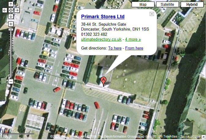
Each day I take a look at my blog stats and today I was mortified to find someone had found the blog not, as I’d hope, by searching for ‘web usability blog’ or a specific topic like ‘ambient navigation signifiers’ but rather “when does Primark in Doncaster open”. Looking at the search result, we can see that my blog is third but the summary returned shows no relevance to the intended search, yet still it was clicked on, why? Do users systematically work their way down the list from top result to bottom? Why do people not make an assessment on relevance before they click? In effect, is this confirming Jakob’s hypothetical question in 2001 that “Some People Are Too Stupid To Serve”? Todd Miller has a short article “In Defense of Stupid Users” which makes some valid points. Nevertheless, I do still despair of some people. Anyway, I hope they enjoyed their visit and, for the record, Primark in Doncaster is open 9-5.30 Monday to Thursday, 9-6 on Friday, 8.30-6 on Saturday and 10-4 on Sunday. (Their website has the detail but alas did not appear in the natural search for the original query)
>> UPDATE: Silly me, they were looking for details of a new store which opened 19th October. Some bloggers are too stupid to write...

16.10.06

The Rise of the User Experience Podcast

The rise of the user/customer experience podcast. A brief summary of current offerings with their three most recent posts…

Boagworld (not strictly a UX podcast but relevant all the same):
> Podcast 53: Ecommerce Usability (09.OCT), 52: JavaScript Libraries (02.OCT), 51: Better Google Listings (26.SEP)

UXpod (Gerry Gaffney’s regular podcast)
> Ethnography (09.OCT) World Usability Day (02.OCT) Market Research (22.SEP)

DesignCritique (Products For People, “Encouraging useful and usable design for a better customer experience”)
> World Usability Day (15.OCT) Alarm Clock Critiques (29.SEP) Wristwatch Critiques (10.SEP)

IA (Jeff Parks’ Canadian-orientated Information Architecture ‘cast)
> User Centered Design (sic) (04.OCT) Plain Language and Usability / Business Process before Technology (01.SEP) Using Metaphors / The Information Architect as Universal Translator (01.AUG)

“Ambient Signifiers” Subtle indicators to make you feel you’re on the right path

The web gives you the chance to do things that aren’t easily achievable in the physical word. It allows us to build metaphors and equivalent processes in a unique way. Take, for example, the fact that when you go to the supermarket you probably approach each aisle in the same order and generally from the same direction each time. Or, perhaps, when you go to your favourite spot on the coast in Cornwall you might take the same coastal path walk that you’ve done for years. Now, this is all fine if nothing ever changes, it becomes so familiar that you could do it without conscious navigation but what if they moved some items around on the shelves or they put a few houses along the coastal path, introduced some stiles and cut down a significant hedgerow? Though the route would be familiar it would not be implausible that you could get lost.

This happens all the time on the web. In fact, in the case of online banks, changing even the homepage style-sheet can result in hundreds of calls to a call centre to check that the site is still the same and is not a phishing cover-page.
Digital Patina
Back in 2002 when the BBC were doing a site re-design they introduced the idea of ‘digital patina’ (it may have emerged elsewhere beforehand, I’d be keen to know if it did) whereby a well-trodden path began to emerge online for return visitors. So, for example, if you regularly visited BBC Sport, the Sport section on the .co.uk homepage would darken over time. The point was not to ensure you always found the right link, your regular visits prove you had no trouble finding it, but rather it was to ambiently re-assure you that the site recognised you and was moulding to you like a well-worn pair of jeans. The BBC described it as ‘having a conversation with the user’.

In other cases this sort of subtle, unconscious cue of familiarity has a more direct role in keeping users on the right track. Underground or Metro networks the world over have to cope with both familiar and novice users completing the full spectrum of navigation paths from the short-stop to the long-haul. Over the years a host of navigation aids have been introduced: station names, coloured lines, matching carriage colours. In the case of the Tube in London the famous map takes its form from the very fact that the traditional ambient signifiers (landscape markers) do not exist underground. These are the obvious ones, but not everyone would realise that the ornate tiling at Tottenham Court road and at other parts along the network is a direct response to the need to introduce identifiable signifiers for the illiterate, which now work as effective ambient visual cues for today’s passengers. In Tokyo, the metro system is replete with unique chimes at each station, reminding the absorbed or dozing commuter that they are on the right route or perhaps providing an unfamiliar ‘wake-up call’ when they’ve over-slept or missed their stop.
Well Trodden Path & Visited Link Colours
There are two possibilities here for the web: Firstly, present some simple cookie-based JavaScript control of the CSS that identifies return visitors and applies style-sheet changes over time. Secondly, that the use of subtle, ambient cues is deployed across the site for everyone’s benefit. Taking these in turn it seems to be clear to me that the first is not widely applied, it didn’t even survive on the BBC and, as good ideas spread so rapidly on the web, I would assume that it simply doesn’t provide any benefit. The the well trodden path is retained in the users mind, much like last year’s footprints do not survive on the coastal path. It used to be the case that visited hyperlinks would be a different colour but this has declined over the years (through a natural coding evolution and the erosion of the ‘blue underlined’ hypertext convention) to such a point that users don’t expect this to happen and, from the usability tests I have seen, they don’t seem to be aware it is when it is employed. The only place where it still works effectively on a massive scale is Google, reminding you of which links you’ve tried.

Secondly, the subtle use of ambient signifiers to aide navigation is widespread on the better architectured sites. The use of relevant colour schemes (e.g. BBC channels online mirror their TV equivalents in colour and typeface), the subtle section colouring for Google, Froogle, Google Groups, Google Maps and Google Directory. But sites could go further. One cue which has developed by accident has been the use of different visual styles for secure or registered-user areas of sites. Traditionally many of these areas were built by IT departments whereas the main sites were built by marketing and creative agencies, the latter changing frequently whereas the secure/registered areas remain consistent. There is often a jump to a new window, occasionally stripped of navigation elements and so on. All of these visual cues remind customers that they’re not in Kansas anymore. Whilst there is a case for better brand alignment (particularly for reasons of consumer trust) which I and Marc at dancingmango (and here)have discussed recently, there is also a strong benefit from letting customers feel the join.
Still Logged In?
To end, two final examples. Sharing access to a PC (despite there being lots of capable hardware in the flat) means that I am forever going on to Amazon (UK), browsing around and then going to add stuff to my basket or wishlist before realising I’m logged on as my other half. Amazon are not good at making it obvious when you’re logged in. the “Welcome, John …” text is lost below the navigation tabs and I’m usually so task-focussed that the first thing I do from the homepage is search, ignoring the ‘recommended for you’ images which might have provided a first line indication that I wasn’t supposed to be there. I’d say this is a weekly usability annoyance that, even given the frequency that it occurs, as a user continues to thwart me. It genuinely surprises me that Amazon haven’t picked this up in testing. I simply don’t feel logged-in. On the flipside, the more contemporary styling of the US Amazon site instantly lets me know I’m in the wrong country without having to look for the $ signs. Finally, take a look at newsmap, a site I’ve mentioned in the past, try and work out what ambient signifiers are at work here … hint, it’s to do with recency and popularity…

The beauty of all this low-frequency stuff is that it doesn’t involve radical re-designs, adding noise to the page, icon development etc. etc. etc. It simplifies and clarifies the user experience. It makes sites feel bespoke or, in the BBC sense, as if they are having a conversation with you, but without needing to employ significant amounts of personalisation functionality.

References
:: “Ambient Signifiers, How I Learned to Stop Getting Lost and Love Tokyo Rail” – Boxes & Arrows
:: “The Glass Wall, The Home Page Redesign 2002” – Liam Delahunty
:: newsmap – data visualisation with ambient signifiers

3.10.06

Body off Baywatch, face off Crimewatch ... do customers prefer it to function, look good or both?


Fortunately in the blogosphere (eeugh) someone somewhere will be talking about a topic that's pertinent to your current interests. This week my regular read of Marc’s dancingmango site hit a nerve (in a good way) by talking about transactional regions (“Most retail banking web presence is just not connected”). At The Company my colleagues and I were recently debating whether transactional areas should look different from static ‘brochureware’. I think they should, or at least that it doesn't matter if they don't. In the olden days, Jakob used to say that web-based applications shouldn’t ape browser interraction. But this was before XHTML and JavaScript reached near universality and the vast majority of users expect a rich interface.

Marc’s spoken in the past about breaking free from linear form completion in a wonderful post (“Shoot the wizard! Designing a real world form”) and I support this idea of complete user control. Where I differ from him, and to return to the point, is that I believe customers appreciate a pared-down approach to look and feel on transactional sites. Yes there are legacy issues and, from our own back-end, I know these things tended to have been built by systems guys rather than web designers but the effect has been that there tends to be less distractive marketing guff (page bloat is another thing .. see below) and provided they’ve been interatively designed and user tested, things tend to work functionally.

I’ve mentioned in the past that I think the future will see us move to a more conversational web and increasingly customers will eschew sites that hark back to the days of padded table cells in favour of sites where the brand fits their expectations and aspirations - but we’re not there yet. We’re still, as consumers, focussed on speed and task efficiency and so sometimes keeping the box of crayons away from the menu board helps keep this focus. That said I am aware of situations where non-native web coders (and by that I mean teams where the day job is back-end code) have been left to develop the presentation layer and the result is bloated code, high page weight and long download times. Not to mention accessibility and cross-browser compatability issues.

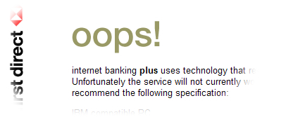
In short, I don’t think we need to sweat it too much when transactional elements measurably work but don’t look great but I do think we need to worry when we separate static from transactional for cost and infrastructure reasons only to find that we’re suddenly using a top-nav where a left nav was before and the page loads would test the patience of a narcoleptic sloth. Marc cites some great examples where this disconnect has resulted in sloppy coding on transactional sites (HSBC image and First Direct image).

My final caveat is that this holds true for financial services sites and the more tedious transactional elements online. It’s pretty brand dependant; Lloyds TSB for example don’t need an exciting online banking service, they need one that’s quick, fully functional, compliant, compatible and secure. On the other hand if the Apple store was all this but visually dry and plain you’d start to feel a disconnect with the brand because, for someone like Apple, their consumer brand runs right through the entire customer lifecycle.

29.9.06

GRO Website Usability Improves

Took a look at the GRO website again yesterday after mentioning a difficult process last year in ordering certificates. Well, despite clinging on to the default ‘no’ option for the reference number (see original post for explanation), I’m pleased to say that they have re-structured the body content on the page to highlight certificate ordering within each registration category. In a delineated ‘shortcuts’ box you can click through to a generic ‘ordering’ page. There are still too many click involved from the homepage to get to that point but it is an improvement from having to dig around in text on the page.

Now, if they could just fix that right-hand menu on the category pages…

27.9.06

one Amnesty Announced

I hereby announce that most noble of things, an amnesty. An amnesty that is on the long-suffering staff of one, my commuting nemesis since 2003. However, before this officially starts I need to add a few qualifiers: that the amnesty lasts until at least December, that it exists notwithstanding a catastrophic service failure and that it begins only after I’ve had my final constructive words to say.

A couple of things have brought me to this point, this zenith of invective. Primarily, a desire to avoid being a one-track blog as the principle focus for it must be my day job, web user-experience. Secondly, frankly I could do without entering into dialogue with staff at one who are as impotent as I am at changing their corporate culture, even if they’re trying nobly. Their hands are tied by process, budget and management and until their bosses (Dominic Booth particularly) start reading this and understanding the pain, there’s very little point. Organ grinders and monkeys.

But, as I say, before the amnesty, one (ahem) last post. Yesterday I applied for my new season ticket. When you complete the bi-annual NX appraisal of one they ask you whether or not you’d choose to use the service again but, like many commuters, I have little choice and so, whilst disgusted by the service, I am forced to hand over money. Money this year which amounted to £4,480 (Chelmsford to Norwich annual season ticket) which is an incredible sum. To put this in to perspective this could buy me a reasonable second hand 2001 model Golf 1.9TDi, or it means that if you work as a one call centre advisor you’d probably have to work from January to mid April full-time on no pay just to cover the season ticket cost from your salary.

What does this get me? It gets a journey time of 1hr 30mins in the morning and 1hr 15mins in the evening at roughly £6.30 per hour. (There’s a cruel irony that when the journey time is longer I pay less per hour so perhaps I should be grateful for delays.)

Now, imagine I’d spent the money on that Golf. Imagine the frustration then if when I went out to drive it, one day a week it simply would refuse to open and let me drive it for ten minutes or so, without telling me why leaving me standing for an undeterminable amount of time. Imagine if, on the coldest, windiest days after work I turned up at the car park and it wasn’t there, for two hours. Imagine if when driving home it just stopped and sat on the side of the road without explanation every 10 minutes for a few minutes. Or as soon as the weather warmed up the air conditioning would pack up and be entirely unserviceable until October when it would work again. Or perhaps if I got in the car only to be told that I’d have to transfer to another one which would drive me somewhere else and leave me in a car park at Stansted Airport for two hours with several hundred other Golf drivers, little advice, no shelter and a requirement to push and jostle to get on a bus to go to another car park when the Golf would then be able to drive me home.

You’d be pretty irritated by your purchase wouldn’t you? But at least your £4480 would last for more than a year, probably – in the case of a Golf of that age - another ten years. With one, I pay for that level of service and it lasts me 12 months at which point I’ll have to pay over £4500 for the same again despite assurances that next year I might get new seats and someone would re-paint it.

I’m not saying that the Golf could get me to work in the same time, the drive from Chelmsford to Norwich is automotively grotesque and it would cost me money in tyres, petrol and maintenance. The point is to get some perspective on experience and service expectations.

The final subject of my criticism is the ‘one’ website. Yesterday morning I didn’t know the cost of a season ticket between Chelmsford and Norwich (blissful ignorance) so I thought I’d have a look on the web. I anticipated it would be a simple process of selecting start and end stations and clicking ‘Go’ or similar. Well, this is genuinely the route I took and the customer journey I experienced (download PDF document 670kb).


We’re nearly at the end now just to say that there are things that one get right:

:: The staff at Ipswich station. Before I moved to Chelmsford I commuted from Ipswich and the staff there were almost entirely excellent, friendly and helpful when things inevitably went wrong.
:: The ticket buying process at the counter/on train. With chip and pin this now takes less than a minute.
:: Delay Repay (-ish). Some recompense for delays but for annual season ticket holders not using season direct it would be nice to have the cash or vouchers for the on-board catering. A week of free coffee in the morning would be a nice touch.

Just think of all the things my £4480 could help to add to that list (reliable punctual trains, new information screens at every station, clear timely relevant announcements, exceptional delay contingency plans, full online ticket facilities, universally clean and comfortable trains, ticket barriers at every station to eliminate free-loaders, pro-active customer service culture from Director-level down …)

And that’s it, from this moment on one are immune, on this blog at least, from criticism.

21.9.06

Wired Lifestyle Usability Issues


I’ve just moved into a new place (see previous posts about Ikea) and bundled in one of the drawers in the kitchen was a telephone book sized folder containing all the manuals for the respective household appliances. I’ve not got round to reading many of them yet as, frankly, there are better things in life.

But this raised a interesting point, how much of the technology and engineering scattered about my place is intuitive and usable? There are certain things that, as a tech-savvy 20-something I should intuitively know how to use: microwave, washing machine, oven, electric shower. Additionally there are things that are new to me: dishwasher, integrated multi-room audio, under floor heating and I’ve enjoyed fiddling with this stuff to understand how it works to some extent. The hardest to ‘get’ was the audio system (an EGi Domos) though to be fair I’ve not even started to look at the heating yet.

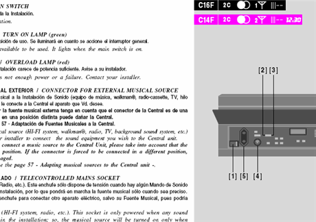
To start with there are two main interfaces, a central control panel and individual room controls. The first is a complicated panel with multiple tiny buttons and LEDs, icons and descriptors are small and not always intuitive. The second is considerably smaller but, being concealed and discrete, was quite confusing in its own way. Within a few seconds of turning the control panel on I was able to start piping radio to at least one room, good stuff. It did seem quiet though… I went to the room control and pressed the two visible buttons, the station changed and it made beeping sounds. That’s all I could work out. It seemed to have two channels which presumably meant one room could be on one channel and another on a different one. Great, still quiet though….

By this point I was a little bit disappointed and complained to the missus that it must be a consequence of the location in a block of similar flats that the volume is restricted. She sighed and got on with her important stuff. About twenty seconds later I heard a loud laugh and a call to come and see what she’d done. She’d turned the volume up by simply opening the smart plastic flap covering the control and pressing the + button. She’s delighted of course, she’s worked out in about ten seconds (she claims it was obvious) and if it wasn’t for her I’d still be listening to it at library volume. Except I wouldn’t because I’d have read the manual eventually in a bid to understand what it ALL does (something girls seem to care little about, they only want to know the functionality that they’ll need). I wanted to write something insightful about how this demonstrates why users are stupid, why the obvious isn’t always so, why basic users (her) are more clever than potential experts (me) and so on but my own personal embarrassment wants to get me off the topic as soon as possible.

Not before I’ve mentioned the manual though. Which is dire. I’m so used to being fortunate to read manuals in my native language that when you find one in ‘foreign’ it can be either amusing (Asian hardware manuals in over-polite Victorian English) or baffling (in this case). The manual was originally in spanish but had had the English translation on the same page in italics making it really fiddly to keep finding the English bits and meant that the pages with diagrams were confused with twice as much text as they needed to have. Why not simply repeat the information in English as it’s done in 90% of guide manuals with the same layout? They’d decided to reduce costs by printing one manual for every product in the range too. So you have to thumb through and find the specific version of the control panels you’ve got installed and then read their pages complete with footnotes explaining that feature x might not be available depending on your installation. I’d really rather be given a piece of paper inviting me to their (ghastly) site to download the specific manual in English for my installation. It would cost less than sending one rubbish bi-lingual manual to every customer and be a hundred times more effective.


To that end I’ve not even bothered to set some of the more advanced functions, pre-set radio, wake alarms, door entry intercom etc. etc. Finally, the input interface for external audio equipment … a 7-pin DIN! I can’t remember the last time I saw one of these for audio, probably on my Dad’s 1970s B&O tape deck. It’s unbelievable that there wasn’t a dual phono or 3.5mm jack input. I spent ages in Maplin trying to find a cable to fit, it did but wasn’t in stereo (presumably down to the peculiar wiring in the DIN) so I had to order a specific part from the manufacturer. The customer experience of owning something like this shouldn’t be such hard work

Nano Technology, Not So Smart Now Are You?

(This is my first post in the new Beta version of Blogger)

Sometimes the little things bug you. Despite being an astonishingly effective product and, more than that, a lifestyle accessory my Nano can still irritate. Why is it that Smart Playlists are not smart on my Nano? I have gone through and set a complicated series of playlists (based on nested IF statements) which meant that, in iTunes at least, I get to hear songs I’ve not heard for ages within a certain genre and given certain ratings criteria. If these core tunes are available in my Nano’s library, why can the software not cope with live updates of the playlist? Sadly it has to wait until the ‘pod is synchronised with iTunes before it updates the play dates etc. However, this information is clearly available on the pod which stores the play date and time and even creates a recently played history. Does anyone know if they fixed this in the new ones?