24.11.06

Young at Heart - Reviews

Following my post yesterday about Young@Heart I’ve been directed to a selection of equally gushing reviews.

:: A manly appraisal by TV Scoop (Shiny People)
:: A long review of ‘Road To Nowhere’ at the Lyric, Hammersmith in September

:: A review by Helen which draws on her own experiences trying to set up something similar
:: A short musing by an American ex-pat living in the UK in ‘A View From England

23.11.06

Young@Heart, An Extraordinary Documentary

Every once in a while you catch a programme on the TV that really hits the spot. It’s all too tempting in the evening to settle down and watch trash. Celebrity guff and salacious docu-soaps for example. Channel 4 last night added a corker to their schedule which I enthusiastically plumped for above my normal diet of crap. Young at Heart followed a chorus made up from old people (average age 80) who have got together under a charismatic and visionary musical director (Bob Cilman) to render pop, rock, punk and soul numbers in a way that you’ve never heard. It sounds, on paper, to be a terribly saccharine fly-on-the-wall but it was actually a profound exploration of ageing, death and our perceptions of both.

As we followed the game chorus line through the obvious challenges of re-interpreting Cold Play and James Brown and as we did so we also explored their deteriorating health, their unwavering enthusiasm, commitment humour and no little talent. Therefore, by the time it came to say the inevitable ‘goodbye’ to our first member we were right there with chorus in insisting the show must go on. And go on it did, with a heart-string-tug in the middle of a penitentiary exercise yard as the chorus sung to a group of incarcerated who – to a man – gave a standing ovation and many did so with tears in their eyes.

The sensitivity with which Stephen Walker approached the programme was extraordinary and struck a fine balance of warmth over sentimentality and no little degree of humour without descending into mockery. Above all this was a documentary with proud characters, philosophy and emotion and if anything justifies Channel 4 and More 4’s mandate it was this.

:: Read Stephen Walker’s statement on the documentary (and his IMDb profile)
:: Find out more about Young at Heart (website down due to bandwidth restrictions)
:: CBS Evening News piece about the chorus
:: UMASS alumni article about Bob Cilman

22.11.06

The Flicker Fusion Explanation For Driver Performance?

Got passed a good link today to an article by Robert Winkler which took me back to my Visual Perception classes at York (under the enigmatic Peter Thompson). It uses a sort of pseudo-science evaluation of the visual capabilities of hawks vs. humans and how this demonstrates the finite limits of driver reaction. I would be interested to see the reaction time differences between F1 drivers, WRC drivers, the public, and fighter pilots. How much is reaction time related to this ‘Flicker Fusion’?

Coincidence means this dropped into my inbox around the same time as I had my eyes re-tested and recently took part in my first Karting session. I suffer from a lazy eye and had hoped that this might explain my one-second deficit in average lap times against my colleagues. My optician had her doubts but I am convinced it explains this – and my ineptitude at tennis.

Any more insight into this kinda stuff really appreciated.

19.11.06

“We wanted no ghost to tell us that”: Acknowledging Our Expertise In Information Architecture.

We’re moving offices at The Company this week and consequently I’ve unearthed some dusty print outs of articles I meant to read. Some of these will end up in blog items in the next week or so and the first to prick my conscience has been a 2002 piece by Jesse James Garret. It was written at a time when jobs were being cut left, right and centre as the ‘new media’ industry euphemistically ‘consolidated’ itself.

With this in mind, it is quite an introspective and defensive critique of the purity of information architecture (IA), seeking to justify the role’s existence. What Jesse James Garret astutely points out is the tendency to justify every decision we make as being supported by user research and testable to within an inch of its life. Personally, I have dwelt on this as someone with a rigorous empirical background in psychology where, if it was not testable it was not truly meaningful. Taking a 'step back' (one for you, Matt) it is worth considering the role of a print editor. When they make decisions on layout, content and indeed the customer journey through their product, they are not doing this based on eight people in a room telling them what they think. They are using their insight, experience and gut reactions. They are doing what they are paid to do – to make tough strategic decisions about what they think is the right way of doing things without having the safety net of user-research to fall upon.

I wish I made more decisions like this. I wish I was able to be more bold and say, “you know what, this interaction should look like this because my years of experience tell me it should”. Too often, perhaps, we sit and listen to customers tell us exhaustively what they want and then agonise about what they meant. To go back to the wants and needs argument that Marc McNeill so effectively summarised recently, how many people would have sat in a focus group three years ago and said they would need to upload video and share it with the world? Not many, but then came YouTube … likewise, who would have thought kids would want to be creating web pages, writing daily blogs and sharing their lives with the world on an unprecedented scale? Not a huge amount but then came MySpace.

Now, I’m not saying that IAs would have foreseen YouTube or MySpace ahead of their users – if we all had that foresight IAs would be being paid a lot more – but it does demonstrate that user-research doesn’t provide all the answers.

If we dwell on making the most usable sites as defined as the sites that pass the user test then we become no better than the teacher who schools their pupils in just enough to pass the exam. The exam in this example is no more reflective of the challenges of life than the user test is reflective of the continued experience of a website by thousands upon thousands or users. The trouble is, testing and metrics deal largely with the quantifiable elements of experience, time taken, click volumes, conversion. Unfortunately these are the predominant currency of business and unless you present such information higher up the chain your credibility is called in to question.

To return to the publishing editor analogy, the editor is top of the tree. Their decision is respected not just because of the experienced opinion but because in the hierarchy there are few people above them. Information Architects on the other hand sit lower down, we don’t have that power and all too often we find our work being passed up the chain, interpreted, interrogated and ultimately ignored as the wishful thinking of an idealist. Peppering a report or proposition with research is our way of protecting our ideas, wrapping them in cotton wool to survive the journey to the senior manager’s desk.

At the end of this journey what lands on the manager’s desk is a collection of research quotes and some proposed designs. What is missing is the insight, the explanation of how we leapt from someone saying they wanted to be able to change their address to a panel in a wireframe with ‘change my address’ on it.

Fortunately the assertion by Jesse James that IA as a distinct role would fade away have not proved correct and in many organisations there exist a team of such professionals. Granted, we have had to broaden our horizons and think about technology and business at the same time but, at our core, we can still be information architects.

Nevertheless the advice still holds true. We should trust our abilities more and occasionally eschew the temptation to commission research at every turn to support our work. We must be prepared to act on hunches and still show our working. Explain and annotate why we have made these decisions but not be afraid to say it was our personal decision and not the decision of 83% of survey respondents. These hunches and gut reactions allow us to work and react faster. Take AJAX for example – we have not had the time to test and research this stuff adequately but we are under immense pressure to deploy it sooner rather than later for the UE and technological benefits. We should be brave enough to generate great interfaces using AJAX implementations based on our experience and get this stuff out there without waiting for XYZ Ltd to fling something out and observing how they get on.

In time, I hope senior management will begin to trust these hunches and – when augmented by the right amount of research – will begin to believe the value of the small collection of experts in their web teams. I’ll paraphrase for my final thoughts: Research data and formal methodologies do not guarantee better architecture. Better architects guarantee better architecture.

17.11.06

The Excel 2007 User Experience


Finally got round to reviewing a blog post from MSDN about the User Experience design supporting Excel 2007. Of course this is all related to my recent exposure to the Microsoft UE process but I’m very interested in this post as it interrogates the charting functionality of Excel.

I have always hated the generic purples, blues and greys of Excel charts that adorn the lazy man’s presentation, pin board or meeting notes. Ignoring the power of colour in visual communication (<- excellent blog link) and the need to engage their audience, many users of the ubiquitous spreadsheet simply deployed the wizard to create a generic chart. In this regard Microsoft approached the problem with the end-users’ problem in mind: how do I create a good looking and meaningful chart? When I create charts in Excel I take a (probably excessively) long time over the style and colour to ensure it’s clear and compelling. More often than not, I’ll begin my charting process by sketching out what I want to see before tracking back to the data to work out how I need to tell the Wizard to work. I consider myself and experienced (but not expert) user of Excel but it’s clearly the users without the time and experience who pump out the sort of drab chart output I described above. So the process needs to work for power users and novices. Sometimes the best charts are mutli-type or multi-dimensional. So, for example, you use bars with lines on two axes and maybe some colouring to demonstrate some other variable. Working out this kind of stuff the first time you hit the ‘make a chart’ functionality has previously been impossible. One of the great featurettes of photo editing software has been the preview functionality of applying changes. Adding this sort of creative sandbox to the charting process enables users to tinker and play with their chart in the wizard environment without getting to the end and committing themselves to the wrong design, only to have to re-launch the wizard to amend it.

The end result for customers has been a template heavy solution that suits beginners and non-creative types but where the design crumbles is its lack of support for power users. As one commenter puts it, the support for people working with complex data has made way for “fluff to make column charts with gradient colours”. Whilst Microsoft have to cater for the large number of business users that just need to present some simple data, the fact of the matter is the tool is powerful enough to be used to analyze far more complex data sets and by ignoring these users they seem to have missed a trick. However, one final ray of light, in responding to these comments it appears Microsoft continue to listen and, where possible, they’ll begin to introduce such functionality in later releases. Too bad their UCD wasn’t quite representative enough.

15.11.06

Do Users Want, Need or Desire A Startup Sound?

Couple of quick ‘hmm that’s interesting’ links. Firstly, related to my Vista post the other day, here’s a short NPR piece on the new Vista startup sound. They only get to the nub of the matter towards the end of this clip so I’d be really interested in other people’s opinions on auditory feedback in interfaces. It’s not something Tjeerd mentioned last week but it’s clearly something Apple take seriously too …

Secondly, I’m always a fan of Marc McNeill’s posts over at
Dancing Mango (etymology of the title?) so was delighted to read the ‘needs vs. wants’ item last week. Coming as it did on the back of Dan’s UX2006 session which had already got me thinking more profoundly about personas, this post is a good reminder about interrogating user motivation. Some of the comments it has received are a little rambling but worth reviewing all the same.

14.11.06

World Usability Day 2006: 14th November


Rather lamely I'm going to link out to the Making Life Easy (MLE) blog today to reference world usability day. I wanted to do something at The Company to highlight everyday usability (which basically involved the setting alarm clocks problem) but that never flew so this MLE blog represents someone else's attempt to illustrate great and grim design. I think this image from the Boston UPA site (and postcard they sent out) illustrates the concept fantastically.


13.11.06

PhotoSynth and Vista. A Leap forward in User Experience?

A lot of good stuff coming out of Microsoft recently. The presentation by Tjeerd at UX 2006 showed some lovely attention to detail for GUI design in Vista (even if some people insist it's a Mac rip-off) and then there's this PhotoSynth stuff from the Live Labs. I blogged about the demo video in August and now there's a working demo available. Be warned, you do need at least a Gig of RAM and admin rights on your PC.
Regarding Vista, There are plenty of jerky videos of Vista on YouTube but I'd read it straight from the proverbial horse's mouth here and take a look at Tjeerd's pages here.
Not sure if PhotoSynth quite works how i'd hoped it would but I do think there's a function of how many photos have been loaded in and how fast the PC is. Several times I clicked in for a closeup and got the other side of a building instead and I'm not sure quite how the 3D dot-map should work - is is a quide to the space you're in? Is each dot a unique photo?

10.11.06

User Experience 2006, London, “User Experience Documentation”.

It was inevitable that I’d want to blog about my session yesterday at the NN/g ‘conference’. What is unexpected however are the amount of thought provocations that I noted down throughout the day with little ‘Blog’ tags attached to them, some of which will end up as fully-fledged posts, others of which are, on reflection, nothing more than idle guff.

I’m glad I chose not to lug a laptop into the city and thereby blog on the day, and I’m even gladder that I took the preliminary letter’s advice to wear several layers too; the room we were in at the Millennium Hotel in Gloucester Road was borderline Arctic during the morning session. Not that that seemed to bother the extraordinary amount of Scandinavians that seemed to be in attendance. I still do not know whether their predilection toward User Centred Design is the consequence of having a Scandinavian guru at the helm (Jakob) or whether it is simply one of those accidental cultural niches that seem to develop. Either way, they were there in numbers, speaking embarrassingly great English and having a justifiable confidence in their abilities. The second largest group of attendees seems to have been the BBC. Looking down the delegate list, I would suspect that half their ‘new media’ department were there in one form or another.

I was there to learn from Dan Brown. An erudite New Yorker (now resident in D.C.) with a dry wit and a decent book to promote. We were a tough crowd, not because anyone was particularly controversial but because despite his attempts to lighten to mood with references to his experiences as a proud new(ish) father something was getting lost in translation and our continental delegates seemed more keen to read ahead in their slide packs. For the record, I thought he was a solid and amusing presenter and frankly when you are dealing with a subject as potentially dour as sitemaps, flow charts and wireframes then any smattering of humour is appreciated.

Dan’s approach has been to simplify web development documentation into ten key deliverables split by ‘User Needs’, ‘Strategy’ and ‘Design’. In the session at User Experience 2006 we looked at personas (user-need), sitemaps, flow charts and wireframes (design). As always, the best way to learn is through a combination of practical exercise and demonstration of the good and the bad, with appropriate discussion around the same. Within fifteen minutes of the session starting, we were already in and creating personas. This was absolutely the right thing to do. As we picked these apart, we progressed through what must have been a cathartic therapy for Dan as he displayed a healthy portfolio of confusing diagrams, schemas and flows from his past, this was a theme persistent through the rest of the day. Dan’s honesty in showing ‘hyperdocumentation’ (by which I mean diagrams and data visualisation on a large and complex scale) from his own collection was a compelling insight to the workings of a man who’s mind he freely admits craves the release of encapsulating his thoughts on paper and on file. Many of his examples showed an exquisitely sensitive use of colour and design to convey a wide range of attributes. A document that seemed inaccessible at first was presented gradually until it made complete sense.

He was challenged repeatedly on his intentionally inconsistent approach to documents (ironically it was internal document inconsistency that prompted me to attend the session) and his response was considered: no two projects are the same; no two audiences for those documents are the same. Bear in mind at every planning stage for your work those people who will be reviewing the document, and the document’s purpose. It seemed that there is no need to slavishly follow a given set of rules (e.g. that personas must show x, y and z and that sitemaps should be formed of boxes and arrows) if the document’s purpose can be communicated effectively without doing so.

Before I attended the conference I blogged that it was expensive and that you have to pay for the privilege of learning from the experts. In Dan’s case and, at the risk of sounding sycophantic, I am glad The Company paid up because it was worth every penny.

I’ll be returning to the themes of documentation and providing examples of my own styles in the next few weeks. Tomorrow however I intend to run through some examples of User Experience tweaks in Windows Vista following Tjeerd Hoek’s plenary session demo at User Experience 2006.
Finally, quick hellos to some people I met at the session: Tero Tikkanen (Vaisala Oyj, Finland) and Nick Pleydell-Pearce (Global Beach [yikes! flash only site], UK)
:: Update with Dan's slides originally posted on slideshare which contain the examples not in our take-out packs.

9.11.06

Mum, today I got an A* in Information Architecture

Remember my post about kids wanting to be User Experience Architects? Well this post from Adaptive Path proves that Information Architecture is so easy* kids can do it ... and they want to :)
* - I'm joking about the easy part. It's not and it costs lots to pay people like us to do it really ... (that's a joke too, sort of)

5.11.06

Browser Zooming, A Comparison

I like running a daft high resolution wherever I can and so sometimes have to make use of browser zooming capabilities. Previously the only option used to be a text size increase function where the CSS allowed but now, as an IE7 devotee I can use their total page zoom function. It's not always great though and this week's post by UK Usability contributor Alastair, does a great job of explaining what does and does not work and why.

And by way of a co-incidence, Paul at Headscape talks about the same issue on Boagworld

Technorati tags: , , ,

31.10.06

It Pays To Answer Customer Emails


Online shopping isn’t all about click through, promotions and abandonment. It’s about the interaction between user, customer and business.

I’ve been looking to get a new jacket for winter. Commuting, and specifically walking between stations and waiting for connections, can be a chilly affair when the temperatures drop. I’ve done plenty of research offline and online. I’m a ‘brand advocate’ of
The North Face (TNF) and spent time looking at both their US and Canadian sites to find the latest gear. I ordered catalogues from Cotswold and Snow & Rock and I spent time in stores like Blacks, Venture Sport and Field & Trek. Eventually I settled on the Plasma jacket, it wasn’t showing on the TNF site for Europe (it was still showing summer gear in October…) but thanks to Froogle.co.uk, I saw it was appearing on several online stores but I was nervous that I would be getting end-of-line 2005/6 stock as we’re in a transitional season.

I had good service last year from Snow & Rock and I liked their extensive and well-produced catalogue but they didn’t have the item showing in stock. Cotswold I wanted to give a chance to as I visited
their store in Betws-y-Coed last year and was impressed. Finally, Venture Sport were the only company showing the jacket as available in the colour I wanted – and they’re local with a branch in Norwich and helpful staff…

Cue a salvo of identical emails to their various customer service addresses. All sent at the same time, last Wednesday. I received just one response, from Venture Sport two days later telling me the key information: The item is the latest version and the current stock wait time (7-14 days). It was friendly, succinct and useful. If I’m being picky I’d have liked a tighter delivery/stock estimate but other than that, spot on.

As a result I’ve just spent nearly £200 with them on the jacket and as of today (6 days later) I’ve still had no response from any of the others. The shopping experience wasn’t without its faults - I did get instant confirmation emails but there were three of them (two merchant receipts and one with registration details) but I was so pleased to finally be getting on with the order that I didn’t really mind too much. I was even able to add some additional delivery comments to ensure it reaches me through the complicated post system at The Company. When it does arrive I plan on spending even more money with them on a few additional clothing items … their prompt, friendly and efficient service has paid off. All because they responded to an email.

27.10.06

Corporate Mugging


Working for a corporation (c.f. agency) has its benefits. We’ve got a Starbucks concession as part of the catering facilities on site and as it’s ‘double stamp Friday’ I thought I’d pop down this afternoon for my usual Grande Americano (data on the GA) (aside: ‘americano’ was originally a derogatory term sneered at Americans when they asked for espressos with hot-water in them to temper the strength, according to a Gaggia salesman & Wikipedia). Anyway, this afternoon I noticed a sign saying 250 china mugs had been half-inched from the café in the last 6 months. Clearly the appeal of having a worldwide mega-brand and, (specifically a twin-tailed baubo siren) on their desk is too much to suppress my colleagues' kleptomaniac impulses.

A Mouthpiece For The Enemy: Is It Right To Interview The Taleban?

I've just added a comment to Peter Barron's entry on the BBC News 'Editors' blog regarding the recent airing of an interview with the Taleban. In my opinion it is a fundamental part of a free media in a democratic country to report all sides of a conflict no matter how challenging and unsavoury. The proliferation of WASPish outrage in the Daily Mail readers' responses indicates just how blinkered we have become in our view of the Middle East. I am no sympathiser of fundamentalism but I am no fan of anachronistic fascist ramblings either or a return to the days when, as one commenter put it, people cheered at the bombing of Hiroshima in part because it was reported reported it as a military success. Honesty, transparency and accountability are only acheivable from a balanced perspective. Read every paper, watch a range of news programmes, absorb the views and make up your own mind.
UPDATE: 27th OCT
The debate on Peter's post now exceeds 100 comments, some of them erudite, others depressingly naïve but nevertheless reflective of an almost 50:50 split of opinion. Because this is my blog and I like to bolster my own opinions, here's someone who shares a similar viewpoint to me [hope they agree :) ] ... and here's a technorati log of recent blog commentary on the post. Finally, Norfolk boy and journalism professor Adrian Monck's has had a bit to say about it too ....

24.10.06

Leaving Logs ... And Checking Them

Though I've had a good old moan about commuting in the past, I'm pleased to say my displeasure with the operator and subsequent criticism never developed into the scatalogical. This deranged individual has, however, served to highlight another curiosity, the British fascination with salacious and sordid news. The BBC's popularity tracker inevitably gets dominated by such stories on slow news days ... I'd love to see Auntie's server logs to see how deep into the site people go once reading stories like this, almost as if they're the hooks that get visitors in to the rest of the news content.

23.10.06

British Web Users Search Less - But Find More

An update to my recent post about odd search behaviour, a colleague sent me a list to Jason Lee Miller's interesting article the opening paragraph reads:"Recent numbers are showing that Google is an even heavier hitter in the United Kingdom than in the United States. But it also appears that UK Internet users are conducting fewer searches, and finding what they need more often." The debate of course is whether this is a true cultural difference or one of coincidental accident.
UPDATE: 24.OCTOBER.2006
The search stuff just keeps coming. Boxes and Arrows have a great piece about search behaviours. Combine this with their notes on Quantifying the User Experience and suddenly I've got a compelling need to get inside our site's search logs ... what are people looking for and how?

22.10.06

Windows Live Writer

Technorati tags:

A significant amount of software has found its way on to my system this weekend. Got a webcam, got a duplicate email remover from Outlook (gave up on Google mail and ended up with 600 duplicates when I pulled the last few months mails into Outlook...) and got Windows Live Writer to help me update this blog more simply.

I'm not sure how this experiment will work out, particularly as it doesn't support the Blogger Beta very well (no label option), but it might at least allow some faster posting and an end to the days of poorly formatted posts or posts with clumsy pictures.

19.10.06

Seeing Red Over Bono's Hypocrisy


Yesterday I posted a comment on blueblog (which had been feted by Product Red's blog) which was duly deleted today (irritating comment moderation...). In essence it pointed out that we should clearly all be doing what Bono says and not what he does. For the record I applaud the (RED) campaign but i'd rather take part without the preaching of a multi-millionaire who uses (like The Stones) every trick in the book to avoid paying tax that would partially benefit the same or similar causes. Graham Norton's had something to say on the subject which, I think, makes a valid point. Albeit it does rather draw the comparison that a crumbling road in Ireland isn't quite as desperate an issue as AIDs in Africa.
> More blog comment about Bono's nauseating hypocrisy
> Fergal O'Brien's comprehensive Bloomberg article, "Bono, Preacher on Poverty, Tarnishes Halo With Irish Tax Move" (16.OCT.2006)

17.10.06

Search And You Shall Find


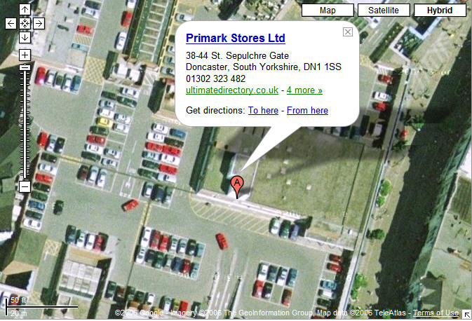
Each day I take a look at my blog stats and today I was mortified to find someone had found the blog not, as I’d hope, by searching for ‘web usability blog’ or a specific topic like ‘ambient navigation signifiers’ but rather “when does Primark in Doncaster open”. Looking at the search result, we can see that my blog is third but the summary returned shows no relevance to the intended search, yet still it was clicked on, why? Do users systematically work their way down the list from top result to bottom? Why do people not make an assessment on relevance before they click? In effect, is this confirming Jakob’s hypothetical question in 2001 that “Some People Are Too Stupid To Serve”? Todd Miller has a short article “In Defense of Stupid Users” which makes some valid points. Nevertheless, I do still despair of some people. Anyway, I hope they enjoyed their visit and, for the record, Primark in Doncaster is open 9-5.30 Monday to Thursday, 9-6 on Friday, 8.30-6 on Saturday and 10-4 on Sunday. (Their website has the detail but alas did not appear in the natural search for the original query)
>> UPDATE: Silly me, they were looking for details of a new store which opened 19th October. Some bloggers are too stupid to write...

16.10.06

The Rise of the User Experience Podcast

The rise of the user/customer experience podcast. A brief summary of current offerings with their three most recent posts…

Boagworld (not strictly a UX podcast but relevant all the same):
> Podcast 53: Ecommerce Usability (09.OCT), 52: JavaScript Libraries (02.OCT), 51: Better Google Listings (26.SEP)

UXpod (Gerry Gaffney’s regular podcast)
> Ethnography (09.OCT) World Usability Day (02.OCT) Market Research (22.SEP)

DesignCritique (Products For People, “Encouraging useful and usable design for a better customer experience”)
> World Usability Day (15.OCT) Alarm Clock Critiques (29.SEP) Wristwatch Critiques (10.SEP)

IA (Jeff Parks’ Canadian-orientated Information Architecture ‘cast)
> User Centered Design (sic) (04.OCT) Plain Language and Usability / Business Process before Technology (01.SEP) Using Metaphors / The Information Architect as Universal Translator (01.AUG)