18.1.06

More evidence of CAPTCHA's failings for impaired users.

Since yesterday's post on the inaccessibility of CAPTCHA, I've been made aware of two additional links. One from Slashdot entitlted "How Would You Design a CAPTCHA for the deaf-blind ?" ... which seems like a heck of a challenge. And another, more militant one, calling for signatures to an online petition to remove the inaccessible CAPTCHA on their services.

On a lighter note one The Register reader noticed that they'd be asked to enter (the word) minge during one application.

I'd be more than happy to accept further correspondence on this issue, add your comments by clicking the links at the bottom of this post. Thanks!

17.1.06

The Usability And Accessibility Problems With CAPTCHA

I’d never considered this problem before as anything other than a frustrated user. And that’s why working in usability and customer experience gives you a different outlook on problems to just wandering the web passing comment.

Then a few months ago I (like many others) started experiencing problems on this blog. Rogue comments were appearing, I was getting fed up with being spammed and I turned to Blogger for help. They recommended I turn on the verification feature whereby users have to complete a challenge-response question based on a distorted image above it. And I did, and the rogue comments have been almost stopped.

The ‘almost’ comment is very important because it means it hasn’t fixed it. The common belief is that it solves 95% of the problem.

This CAPTCHA (Completely Automated Public Turing test to tell Computers and Humans Apart) system is designed to ensure that only humans are completing forms online. Apparently it’s a simple process to develop a program (internet bot) that automatically completes and submits forms and these are used to abuse this functionality on a range of sites. Blog comments is one, insurance quotes is another, loan applications, search engines, online banking and so on. These malicious scripts can then pass data back to attempt work out insurance ratings, banking passwords or even set-up thousands of free email accounts to send spam with.

The problem for the user is that it requires them to do an additional task – and one that does not, at first, appear to benefit them in anyway. Of course, deeper reflection might allow them to realise that the additional server load and security issues that automated form completion causes does actually affect them in the long run but that really is still the form owners’ problem – not theirs. Anything that requires the user to perform increasingly more complex assessments of visual or linguistic perception (other implementations ask natural questions such as Q: what type of food is a banana? A: fruit.) is open to serious accessibility issues. How are the visually impaired supposed to complete such tasks, or individuals with low levels of literacy of linguistic comprehension. When a site requires this sort of challenge-response for every visit, this provides an insurmountable obstacle – potentially leaving the site developers open to litigation for non-compliance with local accessibility law (UK: Disability Discrimination Act and Web Accessibility) . As countermeasures technology improves and the CAPTCHAs get ever more complex, even sighted and educated users can find themselves up against an undecipherable task. There is an excellent document on the inaccessibility of CAPTCHA by the W3C (World Wide Web Consortium).

Finally, the problem can be (if not particularly easily) circumvented. Sophisticated Artificial Intelligence and peculiar schemes whereby people are employed to solve them have been suggested by the W3C alongside more straightforward automated attacks like PWNtcha as methods of bypassing this type of test.

Given that the implementation is clumsy for the user, breakable and therefore ineffective in at least 5% of malicious attempts and that it presents serious (potentially litigious) issues of accessibility, it is my opinion that CAPTCHA is not a viable solution to the problem of automated form completion.

UPDATE:
15:32 17.JAN.2007 Audio versions of CAPTCHA have recently been spotted. But (as the comments on that post show) they do have other associated problems.


Technorati Tags

16.1.06

Ikea Moves To High Street & Enhance Online Experience


The ever-useful Telegraph podcast revealed last week in an exclusive that Ikea were moving to the British high street (or read the BBC article). "Great" I cried on the 08.09 to Norwich. Great for several reasons. Economically the move to support Britain’s dusty, forgotten town centres is a good thing. Environmentally, the decision to accept the government's tougher stance on green-belt development is a noble one. And finally, for us shameful capitalists it's yet another opportunity to source flat pack with even greater convenience.It does also raise some interesting ergonomic considerations. The smaller high-street units will not be able to follow the same format as the gigantic hangar-style design that Ikea currently favour. For those of you that have not experienced the store you should know that the idea is that Ikea take you on a journey through their products. First through large mocked-up sitting rooms, bedrooms, offices and kitchens featuring their products in all sorts of (quite un-British) configurations. This whets the appetite and the customer is then fed (maze-like) down past the products in question, laid out in row after row of category-specific displays. Finally you end up in a huge warehouse with vast racks of flat-pack furniture on shelves. The idea is that you are, by this point, armed with reference numbers and you select the items you want and wheel them to the checkout and thence your car.These stores are not without their critics. The maze-like experience is drawn out (unless you're an expert and can short-circuit it), it becomes very crowded despite the hangar environment, it's so children-friendly that it encourages families more than other stores and it necessitates a car or van to make the most of what have to be scheduled trips. Quite how the central stores will attempt to solve these problems remains to be seen. One of the major stumbling blocks will of course be space. Will there be substantially less products but the same format, or a different format and an small reduction in choice? What would this new format take? The most obvious solution would be to have a small number of key mock-ups which change regularly and then have a limited homeware-style browsing area. Presumably any other items required could be ordered in or identified at out-of-town stores. The most challenging aspect is delivery. Town centres are clogged with traffic or pedestrianised, not really conducive to backing-up the family car to fill it with flat pack is it? Customer experience is a definite corollary of store design in the traditional retail environment – as much customer experience is of web site design. (Here's a good piece on store design and customer experience).

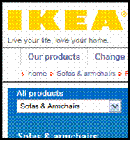
Currently, Ikea’s online experience has come up for some criticism. Take this observation for example (which holds true as at 16.01.06): "Take IKEA's search box. If you do a search for "sofa," you get 21 product hits, none of which are actually sofas. The hits include Ice Cube Tray SODA (for the uninitiated, IKEA names all of its products) and Pillowcase SOVA....If you navigate to IKEA's products page and pull up sofas, you see plenty: over a dozen fabric sofas alone. None of these, however, show up from the search box." [source: Line56.com]

Clearly here there is a disconnect between the in-store experience, where the Swedish naming convention is actually quite a quirky way of identifying a particular product, and the on-line experience where it hampers a natural search. There is, of course, a basic fix here – applying a category marker to products that is identified in the search but it the online team at Ikea haven’t spotted this in a major online marketplace such as the US, you do fear for their implementation in the UK. Ikea’s current UK site is a dumb product catalogue, where you can browse for items and find out id they’re in-stock at your nearest store. The most customer-centric element of their site is a Lingubot, ‘Ask Anna’, which, unlike some implementations, actually appears to be quite effective in solving problems and making suggestions – even serving-up relevant page content.

I look forward to seeing how Ikea progress online and in-town. My guess is though that they’d have to make some pretty big mistakes to dent what is perceived as being a very attractive, customer-centric brand.

14.1.06

Ikea, CAPTCHA and 2meninaboat

Will be posting an article in the next couple of days about Ikea's move to high street stores. It raises some interesting customer experience issues (in-store ergonomics). One to look out for.

Another one to look out for is a piece on
CAPTCHA and usability. Basically, how do we strike a balance between presenting the user with an obstacle and reducing the volume of malicious scripts from reducing the efficacy of an online form? Most believe it's more of an accessibility problem.

This weekend I've continued to track
James and Ben. If you've got a social conscience and a bit of spare cash, donate to their Children in Need effort.

10.1.06

Read A Great Blog and Build An M3 GTR

Regular readers and friends may have noticed two things over the period of my blogging. I tend to have a rather erratic posting schedule and a fondness for my past endeavours of rowing. And so here it is, the third blog entry in 24 hours. But it’s here for a reason.

I’ve been following the Atlantic rowing race chiefly through the exploits of James Cracknell and Ben Fogle. Catching up with them via the Telegraph Podcast, their 2 Men In a Boat website and the official Atlantic Rowing Race site. Whilst their experiences are dramatic and an intense physical and mental struggle, what has fascinated me a little more this week are the tales of Chris Martin and his boat ‘Pacific Pete’.

Dealing with aching distances, fatigue, hunger, fear and technical malfunction when there are two or four people on board is bad enough. When there’s only one person it must be genuinely hellish. Then to read such pragmatic and entertaining blog entries from a guy going through it is genuinely inspiring. I have bemoaned rowing blisters, tendonitis and back cramps after intensive weeks rowing myself, but to multiple this by factors of 10 and add in all the other ocean-rowing factors is unimaginable and he has my utmost respect. I shall be glued to his, and the other crews, progress for the next two weeks to see what transpires.

As a starting point, read the entry for day 41 and work backwards.


On another note. A colleague obtained the first issue (‘only 50p’) of the much-advertised ‘Build An M3 GTR’ magazine series. It contained a chrome effect wheel, foam-filled tyre and a small plastic object. There are 95 issues in this series at a total cost of nearly £600. For that money I could buy a salvaged M3 and take I apart myself over 95 weeks. These things are a colossal waste of money. As typified by DeAgostini ... read the Watchdog report on DeAgostini here and the criticism levelled by Blagger.com.

That said, I could be swayed. By the end of the year I would be a qualified gemmologist, an expert in copperplate calligraphy and have Crimean War toy soldier collection that would be the envy of my friends and family.

In response, a friend writes:

“I find those adverts hilarious. It amazes me that people have so little going on in their lives that they might need a rubbish hobby generated for them.”

“[someone he knows] has been receiving "Build your own robot" by subscription for the last 12 months. I always have a look at it though the clear polybag when it comes. It’s hilarious. Last month it came with some kind of circuit board and some LED eyes. I don't know what it will do when it is complete. Presumably you will be able to press a button on the back of its head to make it say "I am a robot - bibbitty bibbitty bibbitty" and stamp its feet a bit.”

Lovely. Now go and read Chris’ blog.

Web Usability Seminar: London, 25th - 26th January

Posted to me on email today by David Travis of Userfocus:
This 2-day course provides you with tips, tools and techniques to help you apply usability throughout the development lifecycle. It will be useful for software developers, product managers -- and anyone else you want to convince to take your work seriously. Please pass this invitation on!

We have four places left on the seminar. One place is offered free as part of our pro bono work. More information about the course. To be eligible for the pro bono place you must work for a registered UK charity. More information about applying for the pro bono place

WHAT DELEGATES SAY ABOUT THIS COURSE
-"Practical techniques, clearly explained, which can easily be put into immediate practice." -"Lots of good examples of good/bad usability from real life, both web-based and others." -"Great practical tips to go away with."

--- ends ---

9.1.06

Poor Usability on GRO Website

About time I caught up on blogging. One of the dangers of doing this stuff – particularly when it’s closely linked to your job – is that you risk opening yourself and more specifically the people you work for to publicity. What I mean is that if I was to write about what’s interesting and occupying me at the moment, I would be talking about things that my employers haven’t agreed to being in the public domain. With that in mind, whilst I’m excited and busy with usability stuff, it’s not something I can readily talk about.

So, I am struggling to find time to blog on personal usability gripes instead. However as one cost me money this morning I thought I’d share. My fiancée and I regularly do genealogical research as a hobby and with the recent upsurge in interest anticipated by the forthcoming second series of the BBC documentary “Who Do You Think You Are?”, we thought we’d get busy on the popular sites and get some certificates ordered in advance of the rush.


Like most UK-based researchers, we use the excellent (RedWeb designed, hullo guys!) 1837online.com to source the reference number of the certificate. Now, I knew that there’s an official place to order certificates from but couldn’t remember the URL so I Googled for PRO (Public Record Office) and ‘official birth certificate copies’ but I quickly realised I was going knowhere (I ignore pay-per-click ads as they are a distortion of my intentions). A quick scoot onto 1837 and I found the link, GRO (General Register Office), by the way. So, armed with GRO reference number and URL I went to the site. I recognised it as we’ve ordered certificates before and I guessed I’d have an account. Logged in fairly quickly (once I’d selected from my mental database of online passwords…). Now I was happily clicking away when I reached the death certificate form. I was dismayed to find I couldn’t exactly reference the index number that I’d obtained from 1837. This was a pain as it ensures you’re more likely to get the particular certificate you want. Without this code researchers have to do a semi-dumb search using details such as age at death and location. Disappointed (as I’d remembered I used to add it in the past) I proceeded to payment. Another shock. The advertised cost of £7 per certificate was now £11.50. Annoyed, I assumed this was the result of delivery charges which should be included in the total price. I paid anyway – I needed the certificate.

Unhappy with this I went back through the process to find out what I’d missed (or rather not been shown) … so, this is my route:

> GRO home page (click ‘Deaths’ image)

> Deaths Page (click ‘Obtaining death certificates’ in right nav box). Why is the right nav box formed of sentences? There are only 6 links here but it looks like a paragraph of text and the links aren’t obviously clickable because they aren’t coloured obviously. Would it not be better on the left of the screen (the most obvious place) and re-titled:


- Register a death…
- Change a death record…
- Register a death overseas…
- Remove a body from England or Wales…
- Find your local register office
- Get a death certificate

(The order should depend on what the metrics show them are the most accessed links)

I then reached:

> Obtaining death certificates page (scrolled down and clicked ‘order certificates online’ in the body text)

> Certificate ordering service page (4 clicks in now… clicked ‘order a certificate online now’ … thinking “I’ve already clicked on something that said this … am I going round in circles?”)

> Log-in page.

> Certificate Choice page. Now this is where I had the issue, I missed the selection radio button after question 7. This is defaulted to ‘no’ (the most expensive option) so if I miss it, I’m on to the £11.50 form straight away. As this is a key decision point, it should be highlighted and made clear. Ideally it would be the first question asked as it determines the application route you should take.

Overall the site is flawed from a usability point of view and provides a good example of where accessibility and usability are not necessarily the same thing. Whilst it is perfectly possible and reasonable to access this site in a DDA compliant way, for it to be more usable the customer has to configure their browser to amend the style sheet used. The failure here is in not anticipating the customer journey and considering the ‘user’ box ticked in their sign-off simply because the site’s design has passed a number of accessibility heuristics.

Of course, I’m at fault because I missed it but, in the words of Steve Krug “Don’t Make Me Think”. Trouble is, I have to use the site because I have to get certificates.

Interestingly, I believe the error occurred because I approached it as a familiar experience, not a beginner. I spent less time reading the pages and concentrated my energies on the transactional process of obtaining the certificate quickly. A case or more haste, less speed, but it does show you that there are alternative routes through the process depending on levels of experience and as many of these as possible should be supported.

22.12.05

Kate Moss: From QPR to Virgin Mobile...

Having been accused of being somewhat querulous recently with posts about one and miserable online experiences, I thought I'd pass readers a link to the new Kate Moss ad for Virgin mobile. One of the highest rating areas of this blog is the picture of Kate in a QPR shirt (mucky readers) and so I expect this to be a bit of a festive hit. Entirely safe for viewing at work by the way. The bearded entrepreneur and his team have done it again.

Download the Kate Moss Virgin Mobile ad in full. (Quicktime required)

Tim Clarke, MD of one, resigns


I wanted to open this blog entry with the line “today I got an early Christmas present” but, as I hope you’ll soon discover that isn’t really the feeling I want to capture. I’m actually disappointed. A bit like opening said present and discovering that it’s not quite what you wanted it to be, an Action Man without working limbs for example.

Regular readers of my blog (aside: may have been disappointed recently by the lack of entries) will know of my frustration with one railway. Only last night I threw away all the letters I had stored up following compensation claims for punctuality problems in the last 18 months. I had intended to log these and produce some kind of graph for you all, the true figures of performance shame but instead one did it themselves.

They released figures this week that were awful. Dropping from 88% punctuality (2004) to 81% (2005). The thing is, this represents all journeys on the London-Norwich route, taken over the commuting peak period I bet it’s so much worse. The figures from the rail regulator show that the train companies are still nowhere close to punctuality figures from seven years ago when the average age of rolling stock on the lines was, on average, 10 years older.

In April 2004 Tim Clarke, existing MD of Anglia was unveiled as the new MD of one. He bought with him all the problems of the old network but presented a vision of the new and, to be fair, things did improve a little. Statistically, more trains were provided, more punctuality and reliability. But in the last quarter we have experienced some horrendous episodes and despite peculiar recognition at customer service awards he has stepped down. These awards are the result of innovation in customer service – i.e. their Delay Repay scheme: acknowledging that they get things wrong, not necessarily doing this with compassion, competence or the intention to improve it. This system is flawed, both for the customer and the company:

1. The company have to pay out vouchers and this must inevitably cost them money. If it doesn’t it costs Network rail money who then can’t invest it in improving the service.
2. The customer gets a voucher which, if they are a non-London commuter, is useless unless you store them all up to offset the season ticket each year. By which £50 (last year’s income from claimed compensation) off a £2300 season is just over 2% … this infers that 98% of the service I paid for was acceptable. Simply untrue.

You’ll see from previous letters, most notably this one, that one don’t actually have any innovative ideas about customer service. They’ve developed one as a way to say “we’re doing something” but it’s the whole package that’s in need of innovation. In a way it’s disappointing that an MD has to resign as it’s not useful to have to start again, at least Tim knows the line, knows the organisation and knows what needs to be done it’s just so sad that the whole team don’t seem to have the answers. I’m guessing we’ll see a grand announcement shortly after Christmas as to who’s to take over and loads of talk of new trains, better service etc. etc. But much of this will already have been set-up by Tim Clarke and the momentum will already be there. What will really happen is we’ll have a honeymoon period of good intentions and a desire to improve followed by further stagnation. Until train operators start employing visionary charismatic leaders (like Branson) and use the energy and innovation seen outside the sector, more heads will roll and the trains, increasingly, will not.

Footnote: one recently sponsored an Anglia business award, the award for customer service in fact. I'm not sure whether this demonstrates intent or irony.

30.11.05

Lotus Exige Written Off After Valet Boys Take It For A Spin


Newspapers report today the story of Dan Gould
who took his Exige in to be valeted before sale (cost: £80) only to be told later by the foreman that it had had a bit of an accident.

Sadly this absolutely fantastic piece of engineering was written off by the numpty that was driving it. I suppose Mr. Gould can't be too distraught, the valet company's insurance (Master Valet, Exeter) should cover it - and he was selling it anyway.

Taking a look at the photo it shows just how catastrophic collisions can be for the body work on these composite-clad cars however, the driver's door opens fine and the cockpit is intact. Note also how little damage there is on the Peugeot's near side - a result of the impact absorption properties of the glass-fibre composite body.

:: How the Exige looks when intact
:: The BBC News site for Devon is featuring this story.

28.11.05

Christmas Shopping Online Isn't More Enjoyable Than The High Street, Yet

As it’s Christmas and we’re all spending a large amount of time shopping online you’d hope it would be more pain free than standing prone in Marks and Spencer on a cold Saturday afternoon. (Aside: Why is it that you always dress up for a cold day pounding the High Street but actually spend 90% of your time inside super-heated stores feeling queasy?)

The trouble is, the online experience still, too often, collapses into a farce as soon as you click the ‘checkout’ link/button. Ignoring the usability crimes that permeate the browsing and selecting process, it is the interminable form-filling that I hate. I must have registered now on so many sites. Really I only want to register on sites that I use a lot. Imagine the hassle of having to register to enter a shop on the High Street? “Sorry sir, you’re a new visitor, please take the time to fill out this form and provide us with your email address and password before you come through the door. “

Alongside the sheer time and effort that is involved in doing this, it’s desperately insecure. The human mind being what it is we’re more than likely to use the same email address and password combination all over the web as it’s simply too much hassle to generate new ones each time. Various people have offered solutions to this problem: e.g. have one Excel file that’s password protected and contains a list of all your log-ins which is still more hassle than not having to register … which is my preferred solution.

Why can it not be possible to visit a shop online and buy one item and leave without leaving them all your details. I don’t truly value a personalised portal experience on every site. Granted, on Amazon it’s started to be a powerful tool … but that’s because I’ve invested hours tweaking my recommendations and rating my purchases. It’s unrealistic to expect me to do that on every site.

One thing I can’t make my mind up over is the multi-part form. Do I want to fill out a form that’s all on one page (so I can see all the fields) or do I want to do a step-by-step form where I perceive that I’m going through small chunks of the form (and possibly only being shown the most relevant fields). I’m not sure. It depends on whether there’s enough of a progress indicator on the step form. It might say I’m step three of five for example but it might be that step four is a huge time-consuming chore. That’s why I prefer time-related progress indicators: “you’re two minutes away from checking out” If this is timed on the lowest common denominator then you’re going to exceed expectations – invariably A Good Thing™.

Worst of all however is when a form tells me I’ve done something wrong and then fails to either show me where this error is or identify how I might correct it. PostCodes are a classic example: “PostCode not recognised”? It could be that the PostCode is three steps back in the form requiring me to skip back through the process (hoping that the session has cached all my input) and, even then, I still think I’ve input it correctly. The answer is that the back-end can’t actually recognise the spacing so XX1 1YY should be input as XX11YY. If you want the PostCode in a certain format then say so, otherwise introduce scripting to account for the multiple variations in the way that users input it – the same is true of phone numbers, dates of birth and credit card numbers.

I wonder how much all this would have bugged me were it not for the fact that I’ve been reading these usability books?

I’ll keep a log of my best online e-tailing experiences and post them after Christmas.
In other usability news
Meanwhile Google are being incredibly proactive (and maybe a bit Big Brother) in opening a Google Space usability lab at Heathrow where they can assess a large volume of user experiences. Jesper Rønn-Jensen and Thomas Watson Steen alerted me to this through their Standards & Usability blog
Technorati :

25.11.05

one anglia continue to disappoint

At 9pm last night I boarded the delayed 8pm from Liverpool Street to Ipswich.

Before we got to Whitham we were delayed further by ongoing problems with the overhead lines at Romford.

The senior conductor offered her apologies.

Then the train in front failed. Then there was a medical emergency on the train, a doctor was requested.

Then the train in front was to be towed. More apologies. Then the train couldn't be moved because the brakes had seized. Then there was congestion.

Eventually we did move, slowly, between stations. We arrived in Ipswich over 2 hours and 20 minutes late (at 11.40pm). My ticket had cost £52. It took nearly 3.5hours to get home.

This isn't all Network Rail's infrastructure, this is unreliable trains too.

The icing on the cake? This morning's 08.09 from Ipswich left at 08.30 ... due to overhead line problems at Romford. It never ends.

See also: Open Letter Complaint & Response Fire On one Railway Fire On one Railway: Their Response Commuting's Better By Bike one Opportunity To Shine Missed Idioms Idiosyncrasies And More Service Failures

Technorati Tag:

23.11.05

Brad and Elizabeth Email from KPMG

Claire Swire-style email doing the rounds today [explicit content]

Brad,

It would be difficult for me to be any more miserable right now, I feel like the worst person ever. First, let me start by saying that I am truly truly sorry, and I hate myself for hurting you. Of all the people in the whole entire world, you were honestly the last person that I would ever want to wrong in any way. There is no excuse at all for anything that happened, so I won't even try other than to say all of us had WAY too much to drink, and I did a stupid thing.

I can handle you being pissed at me, I absolutely deserve it, I can even handle the ugly words that were exchanged between us, what I can't handle is thinking that you see me as a different person. It is weird, I feel like I just went through a horrible break up or something.
The world looked funny yesterday, I couldn't crack a smile if you paid me, there are songs I can't listen to, and I just ! feel beyond crushed. I don't know if you meant everything you said to me, and I am hoping that you didn't. I know that I was wrong on many levels, but I am also
hoping that this is something that we can deal with.

I know it sounds totally crazy and stupid, but you have come to play such a significant role in my life, I can't imagine my days without you. It is totally strange and weird to say that, and you could say that my behaviour didn't reflect that, and you would be correct. I hate feeling
like you hate me, and I hate feeling like all of your friends think I am a terrible person, because I am not.

I know there is nothing I can say or do to take back what happened, but I just want you to know that fighting with you was just about the worst thing I could have ever imagined. It was right up there with one of the ugliest nights of my life, and I would give anything in the world to rewind and fix it. I am not sure if you will respond to this, part of me thinks that you won't. If not today, then maybe some other time.

Also, thanks for getting my stuff together, although I think my sunglasses are still at your house, if you could keep your eyes peeled for them that would be great. I can't even focus on work today, I can't eat, I seriously feel like it was an ugly break up and I am hoping against hopes that it was not that and you are not done with me.

Please don't cut me off, I really don't think I can handle that.

I am so sorry.
Elizabeth


Dear Elizabeth,

Thank you for your concern. I'll be sure to file it away under "L" for "Long-winded diatribes from drunken wh*res I couldn't care less about". You did a stupid thing huh? No...doing long division and forgetting to carry the one is "a stupid thing"; Mixing in a red sock with a load of whites is "a stupid thing"; Bl0wing some guy in a bathroom for 45 minutes while I sit at the bar wondering if you're taking so long because you ate too much bran that morning isn't as much
a "Stupid thing" as it is grounds for permanent removal from my social calendar.

To be honest, I'm not sure if it was more amusing that you went and degraded yourself in a public toilet not once but twice in a 2 hour span, or that you seemed to think that by saying "Well, I didn't love him" somehow gave you a clean slate. So forgive me if I couldn't care less if the world "looked funny" to you yesterday. Since your world revolves around blow dryers, golden retrievers, Prada Bags and Jelly Beans, I'm sure it must have been most unsettling to actually have to consider someone else's feelings for 24 hours straight.

The good news for you is that my friends don't think you are a terrible person, they just think you're the average run of the mill c*m-guzzling blonde who commands about as much respect as your average ch!ld p*rn collector. I could be wrong but, it's pretty hard to respect some chick who comes out to spend the night at my place even though she's seeing someone else and winds up tongue-bathing the taint of anyone who decides 30 minutes of droning commentary on Colin Farrell's new haircut is worth putting up with for a hand j0b in the men's room. The good thing about being a guy is that when I eventually bump into the young lad who finger-blasted you on top of a towel dispenser last saturday, we'll have a shot and laugh our heads off about the time it happened. By the way, for the amount of time you claim to spend in spin class you really must be doing something wrong to sport the thunder thighs you do. Watching you parade around my bedroom in a thong was a little like watching sea lions mate. Thought you might like to know.

Talk to you never,

Brad
PS. I BCC'd about 100 people on this email.


Brad Mitchens
KPMG Executive
Corporate Finance - Valuations


Technorati Tags:
::
::

21.11.05

'one' Customer Services Response

Well, as promised, I can now post the response from one to my lengthy open letter complaint a few weeks ago [the response was received shortly after my email but I have held back to allow other postings to be made].

customer.services@onerailway.com
Contact reference: 168858

Dear Mr Gibbard,

Thank you for writing to us. I was sorry to read that your journeys with us have not been to the standard you expected.

I am sorry for the delays you suffered last week. We work very hard to make sure that all our trains arrive on time as we know that any disruption to our passengers' journeys is both inconvenient and frustrating. I have checked the logs for your journeys that week, but the reasons for the delays were different on each occasion. [JG: does this matter to me? A delay is a delay but I should hear them out...] Most of the problems were with the rail infrastructure, which is operated by Network Rail [JG: reads "not my problem guv"], although on one occasion an error by one of our drivers was a contributing factor. We do realise the difficulty that delays cause, and are in constant contact with Network Rail to ensure that such problems are kept to a minimum. [JG: what's the incentive for N.R. to ensure it doesn't happen.]

I am sorry that you have found that we have not been keeping you informed about delays to our services. We understand that this is vitally important and will always try our best to give out the most up to date and accurate information available. Unfortunately, during times of disruption, it can be very difficult for our staff to do this as the information they are being given by parties such as Network Rail, is constantly changing.[JG: Not good enough. Explain this to customers at the time, don't wait for complaints. If Network Rail say the problem is x say to passengers that "Network Rail say the problem is x" it's only fair. This still isn't happening though...]

We also appreciate how upsetting and frustrating it can be to be told one piece of information, which then changes within minutes. Therefore, we always try and get the correct information first before announcing this to our customers [JG: Not so. Passengers rarely get any info at all.]. It is unfortunate that this can take some time to be confirmed.

Our information boards run on an automatic system that updates the expected time according to when our trains pass the signal points. Unfortunately this can mean that if a train is stuck at the signals outside the station [JG: sic, this indicates the letter was not proof read before sending...]

We are currently in the process of introducing refurbished rolling stock on our mainline services, which should provide a far more comfortable environment in which to travel than that which is currently provided. All of our Norwich to London carriages are set to be replaced by May. These will have improved heating and air conditioning systems. [JG: UPDATE I have travelled on two of these services. This 'far more comfortable environment' meant re-upholstered seats, floor and wall carpets and a lick of internal paint. That's it. Oh, and the improved heating/air con just means that it works, for the moment]

I do not think we are planning to introduce the kind of facilities that you enjoyed on your GNER service. [JG: Why not? There was mention of in-train WiFi in the service magazine a year or so ago, customers demand more...] There were plans to introduce on train television, but this proposal did not prove popular with our customers. [JG: I never mentioned this. In train TV clearly is a bit daft. In-train audio and broadband has proven to be a success elsewhere.] We have been innovative as a company in other ways however - our 'Delay Repay' scheme for compensating people for delays to their journey is one of the most generous among train operating companies, and our website consultation exercise on the proposed changes for the West Anglia timetable (a first for the region) received warm praise from the Rail Passenger's council. We are currently developing our 'Season Direct' service, which will allow people to pay for their season tickets via Direct Debit at approximately one twelfth of the season ticket price. [JG: better, and service orientated. But the best companies are always innovating not just reflecting on their Greatest Hits!]

I have spoken to our buildings manager, who has informed me that we did not repaint Ipswich station during the summer. [JG: reads "liar". The reverse is true. The outside of the station WAS painted in white and a few other bits in Anglia green.] Unfortunately the display board at Ipswich has not been repaired due to a dispute with our contractors.
This has been on-going for some time, but has been resolved, with the contractors agreeing to repair or replace the board soon. [JG: No, not good enough. The board should have been fixed first and the liability for repair/replacement settled later. The customer should have been the prime concern, not who was to blame.]

The installation of matrix displays at rural stations would require significant investment, as at present many of these stations have no connection to the information systems. If you had any particular stations in mind, I would be happy to look into this further.[JG: Crossed-wires. I meant more screens at Ipswich and Norwich. I maintain this desire as passengers should be able to stand on the platforms and see the screens from almost any point. This would provide a more even distribution of passengers joining the train at various points.]

With regards to the service our staff offer our customers, we are committed to delivering a regular Customer Service Training Programme for all our front line staff. From April all our staff will attend a three day Customer Service Culture course at our new Customer Service Academy located in Stratford. This is a significant investment in this area, and along with better recruitment ideals we hope that our customers will see a better and improving level of customer service across 'one'. [JG: A Good Thing. Will wait and see. Some of the younger new recruits are much better.]

I am sorry that you are dissatisfied with the announcements made by our conductors. We do not have a set 'script' as such for what our conductors should say on their announcements, but allow them to welcome our passengers onto our trains as they see appropriate. Of course, we expect our conductors to offer a warm welcome, and I assure you that our announcements do meet basic health and safety requirement.

Our website currently shows a selection of our most popular fares. We are intending to introduce a more extensive facility on our website in the future, although I do not have a set date for this at present as our I.T. team are also engaged in other projects to help improve the service we offer. [JG: "we'll get round to it. At the moment we're building more online games and marketing gumpf"]

I hope I have managed to answer your points to your satisfaction, but if you would like me to expand on any issue, please let me know, and I would be happy to do so.

Once again, I am sorry that you are dissatisfied with our service, but I hope that you will see an improvement soon. Thank you again for contacting us.

Best wishes,


xxxxxx
Customer Relations Advisor

JG: Ok, so xxxx deflated a few of my arguments but I have to say I was a little disappointed that he didn't rise to my tone. More seriously I was genuinely disappointed not to receive a phone call or get any real sense that they worship the customer at one. There's an impression of a persecution complex there. I know that Network Rail are to blame for much of the problems but until one make the customer feel more valued, they will continue to be the public repository for all the commuters' ire. The saga continues...

More usable web pages: Sticky content and customer-centric design

Andrew Henning from redweb sent me this 1837online and, more recently their wonderfully accessible and usable site for UK Clinical Research, you could do a lot worse than give Andrew’s wise words a look.

In the theme of accessibility and usability being mutually exclusive,
Jakob's recent Alertbox is a short bleat about how making things disability-compliant does not mean they're particularly usable. And, by implication, a site that is usable might not be (universally accessible).

Bought these three books recently and am ploughing through them...


:: Emotional Design, Donald Norman
A follow-up of sorts to his seminal
The Psychology of Everyday Things. I saw the review of this on the UX Web Magazine and just knew I had to read it. It made me think which other Usability tomes I've neglected, so I ordered ...

:: Don't Make Me Think: A Common Sense Approach To Web Usability 2nd Edition, Steve Krug
Criminally for someone who talks about this stuff I've never owned this book, just referred to it. It's now in my arsenal and revisiting its themes has been like meeting up with an old friend for a tall Americano and a bluberry muffin in Satrbucks. He's just so, right.

:: Defensive Design For The Web, Matthew Linderman and Jason Fried
An absolutely crucial read for me at the moment as I work on (re)developing online forms and the user experience thereof. Should tie-in nicely with the other two.


Technorati :

18.11.05

Presentation Style: The Art of Simplicity

A colleague passed me a link today to this page on Presentation Zen. I happened across Steve Jobs' presentations when tracking the launch of the new iPods and had adapted his style to some recent PowerPoint™ slides at work. Particularly noteworthy in this article is the reference to the Microsoft™ style of presentation (regarded as Really Bad PowerPoint by Seth Godin). If you take nothing else from this article, take the quote:


"Simplicity means the achievement of maximum effect with minimum means" - Dr. Koichi Kawana

Examples of Steve Jobs' presentations are available for those with broadband and QuickTime™:

:: October 2005 Special Event (iTunes 6 and iPod Video launch)
:: September 2005 Special Event (iPod Nano launch)

15.11.05

Birmingham or Beaver: What is our priority?


Regardless of your opinions on the matter (the matter, that is, of biodiversity and the repopulation of the British countryside with boar, beaver and frogs) a recent article by Jeremy Clarkson concerning the South Cerney reintroduction project is a genuinely entertaining read.
For an alternative viewpoint a South Cerney Beaver Blog is open...

9.11.05

"Ai No Corrida" Video


Bit late in identifying this one, but anyone who was a fan of the Eric Prydz Call on Me video might be interested in one of the dancers' solo projects. Laura More and Scottish dance outfit Uniting Nations have produced a particularly male-orientated video to their song Ai No Corrida.

UPDATE: 28th November - there's now a full length version of the Laura More Ai No Corrida video doing the rounds. It's 50+ Mb though.

8.11.05

Sporty People: Fulfill Those Competitive Urges


Got pointed in the direction of a useful site the other day, it's still in concept form but the questionnaire on the site (where you can win an iPod) hints at some rather intruiging functionality. The basics are thus: Sports people training alone or in non-competitive environments can log their results, times or achievements on the site to compare against others. This could be a mini league of friends, national leagues and so on. As a resource it has huge potential - especially for de-motivated sportsmen like myself who struggles to see the competitive element of going out on a long run on his own on a Sunday.

Of course, the basics will have to be right but this can only be achieved if the sort of people that use it actually go there now and let them know what it should look and feel like.

In other news ... my time at The University of York Boat club may be far behind me but that doesn't stop me keeping in touch. The oldblades site which I neglected got taken over by John Slade and the new clean, lean and fresh site is available. I've updated a whole range of people's profiles but if you knew me from those days or are looking for old rowing mates from York then visit the site.

7.11.05

talar du engelska?


Bought Teach Yourself Swedish last week and have begun the long and arduos road of teaching myself to speak the language. I've long been interested in the language and as winter approached and the prospect of a trip over there in 2006 seemed more likely I thought now's the best time to sit back on the train and get to know the basics. I'm not a natural language person when it comes to anything other than my mother tongue and this is no exception. To put it mildly I'm finding it hard. Updates as and when....

In the meantime, adjö